The Effects Of Mobile-First Indexing
The Effects Of Mobile-First Indexing
As smartphone and tablet users overtake traditional desktop users, the way we use the internet has shifted in recent years. Once tied to a cumbersome monitor and tower, users can now browse the web from anywhere in the world, on devices less than a few inches wide.
In response to the changing demands of users, Google has launched mobile-first indexing, effectively changing the way companies need to manage their search engine optimisation (SEO). After much hype, the new indexing strategy was initially rolled out earlier this year, with some businesses already investing heavily in their mobile-first rankings.
How Does Mobile-First Indexing Work?
These days, the majority of users browse the web from mobile devices and, due to this, Google wants to make their user experience as positive as possible. In order to do this, Google will be taking mobile websites into account when they are indexing search results.
However, rather than simply including mobile sites in their ranking algorithms, Google now ‘crawls’ mobile webpages first and uses these analytics when calculating their search results. This means mobile sites will have more of an impact on search engine rankings than ever before, with many site owners eager to appear on the first page of keyword searches.
Should You Have A Mobile Website?
Although Mobile-First indexing means mobile sites will be used first to rank search results, they aren’t the only thing to be taken into account. Traditional desktop websites will still affect search rankings, particularly if Google is unable to find a mobile version of the site.
Technically, this means site owners could choose to maintain their desktop site and avoid having a mobile version available to users. While this could affect their rankings somewhat, their desktop site SEO activity will still be used and the site should, therefore, still appear in relevant search results.
However, the benefits of having a site which functions effectively on mobile devices cannot be overstated. With the majority of users relying on mobile devices to browse the web, sites which do not cater for mobile users are likely to be doomed to failure – and so are the businesses running them. And Google has been extremely clear on this: sites that are not fully responsive will be demoted from search results. So, it could not be more important to not only have a responsive website but also to maintain it and check that it remains responsive. Adding new content, editing page content and features could potentially break responsive scripts and code. It might look fine on the desktop version, but owners and editors (as well as developers!) should regularly check that the site performs as expected on mobile devices. Most cases of responsive design breaking are due to the CMS. We use Siteglide to build and maintain websites because Siteglide's CMS completely separates content from code meaning anyone can use it (without needing knowledge of HTML and CSS).
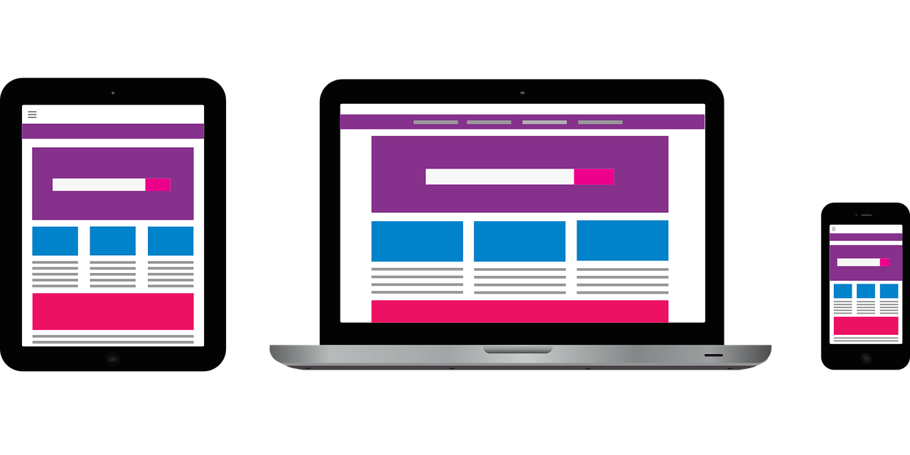
Why Should You Have A Responsive Website?
For site owners who have already embraced responsive web design, the shift to mobile-first indexing will have minimal impact. Rather than having two separate desktop and mobile sites, responsive web design enables you to have one website, which responds to the needs of the user. After all, who wants to maintain two different sites?
If a user is browsing your site on a smartphone, for example, the graphics, text and content will be optimised so that it’s easily accessible and functional. Alternatively, another user could access the same site on a 32” Smart TV screen and have it optimised to their needs.
In addition to enhancing user experience, responsive web design ensures your rankings won’t drop as a result of mobile-first indexing. Responsive web design means you benefit from having just one site, rather than a separate desktop and mobile presence, and your SEO efforts will reflect this. Furthermore, Google recommends responsive web design for effective mobile optimisation, meaning you can secure your place in the search rankings by ensuring your site is responsive and functional across various devices.
To find out more about mobile-first indexing and responsive web design, contact WYSI today. We are offering a free website audit to check for responsive issues; just ask!